Logo by GaryCXJk

Retour à la page initiale

The second Charas Contest is over!

First thing: many thanks to all the partecipants and to the judges, great jobs from both!
If you are interested in 2nd contest's history, click here.

As for the 1st contest, every resource have comments from every judge.
Hope they'll help you to understand eventual mistakes, just to become better every day.
Having more judges cause also different ratings: there is a good balance between "look" and "tercnique".
So don't be angry if someone rate you 8 and someone else 5: it is simply from different points of view.
And, i have to say, this is nice: a Charas resource need both "good looking" and "good realization". This is why i am so happy about this cross-judging.

Many thanks also to Otaku and Seph, from RPGSchool: they are our affiliates, and soon a strict collaboration between us and them will occour.
First of all, the international chat! And, more important, their international section of the school (a school where learn all about RPGMaking secrets, the name says it all!). So have a tour there, soon we'll grow more helping them in filling this international section! ;)

If you want to comment the results, please do it here.
P.S.: a last note about charas resources.
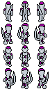
The best rating was for The_Brave, anyhow he was also the winner of the 1st contest, so here he is in place "0".
Consider him as a "special guest winner", i'm writing this just to aviud misunderstood in place order.

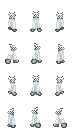
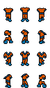
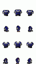
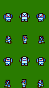
So, time for words is over: here you have the results!

Alex

  FACEGEN RESOURCES
facegen resources - charas resources - final words from the judges

RESOURCE COMMENT
Place Resource Avg Gary SMB Seph & Otaku Alex
1 FFL2and3Rocks

7 7.5
Well, this one is a bit simple, it only has a few colors, but it is good, things like that don’t have to be too complicated.
7
Simple but nice!
6.5
A good resource, but it lacks in shadings.
7
Simple, anyhow useful and good looking.
2 Winterheaven

6.5 
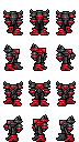
7
Nice, a bit plain, it could use some shadow effects. Also, it would have been nicer if the ear was removed with the almost-white trick.
6.5
Something to fix, it's nice and very original.
5.5
You should try to add more shadings and drawing it better
7
Not bad, but two errors: one white pixel left in the middle and no "almost white" around, needed to avoid, for example, ears outside. It would have been rated more.
3 Sharu

6.38 6
Well, not sure about this one. I don’t actually know what this represents.
6
It seems very similar to already uploaded resources.
7
Beautiful expression, maybe too moved to left.
6.5
Good smile, evenif very similar to other Roco's ones.
4 Moo42us

6 7.5
Nice, very nice. And all in a short period. It’s only sad the eyes weren’t removed first (it did got removed in the Faceset Generator).
6
Wrong positioned, on faces shouldn't be so hard to check.
5
No shadings, and different eyes color.
5.5
Ouch! A resource with item+eyes together...
5 Soulblade

3.67 
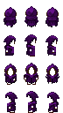
3
This could have been an original concept, BUT it was made in BMP, which wasn’t allowed by the rules. Also, it doesn’t fit any of the resources, and it is too simple.
?
Not rated
4
It’s simply a circle with ears.
4
Techincally, the real problem is it's a BMP and doesn't fit any existing set.
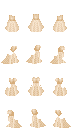
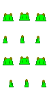
  CHARAS RESOURCES
facegen resources - charas resources - final words from the judges

RESOURCE COMMENT
Place Resource Avg Gary SMB Seph & Otaku Alex
0 TheBrave

9 9
This looks awesome. You would think it is a robot suit, but it’s actually knights-armour.
10
Italian comment directly from SMB: Troppo bravo, basta umiliarci! XDDD
8
Very very beautiful, with nice shadings.
9
What to say? GREAT!
1 Adjuma

8.5 9
I think this one is really fine, next to the other dress. This one is even better. I like the shading. It can appear to be blurry though.
8
Original and really well positioned! Moreover, evening female dresses was needed.
7
I like this resource: it has good shadings and it's the only resource for female charset posted.
10
IMHO this is THE female resource. Absolutely nice, well positioned, well detailed and very nice animation!
2 TheBrave

8.38 8.5
Ahh… the cape. It’s a splendid job you’ve done here, BUT there is one thing I need to note. The front side doesn’t only look like it’s just a recolor of the back side, it is.
10
Italian comment directly from SMB: Troppo bravo, basta umiliarci! XDDD
8
Lacks in movement but it's simply wonderful.
7
Nice usage of colors and shadings, but too static. With some moving enanchements it would have been rated 10!
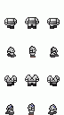
3 TheBrave

8.13 8
The helmet isn’t as great though. Of course, it looks good, but that’s all. Still scoring high though.
9.5
0.5 less for wrong usage of the almost white trick.
7.5
Very Beautiful
7.5
Nice and useful. Maybe some movement in frames for the helm tail would have been a great improvement.
4 Adjuma

7.88 8.5
Well, this one is kinda cool. I love it, I would use that in ANY RPG. But it could be a bit more femine.
8
Original and really well positioned! Moreover, evening female dresses was needed.
7
Maybe to clear and few detailed.
8
Maybe few detailed, but very nice in effect, as a female dress it's surely for the top 10!
5 Adjuma

7.75 8
Very nice, the daggers aren’t so clear though. Maybe no small daggers next time? But it’s great to see more tall resources. PS: Didn’t notice they were small daggers until I saw the description in the generator.
8
Original and really well positioned!
7
Beautiful resource. We didn't like too much the back frames.
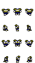
8
Absolutely nice. Good position, original and good animation effect!
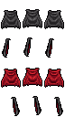
6 Onichi

7.25 8
Good, very good, but it would have been better if you put at least a big circle in the back to show it is Goku’s.
7.5
Really nice evenif nothing special.
6.5
Few detailed.
7
Simple but really nice!
7 Drhaut2

6.88 8
This outfit really gives me the Vengaboys feeling. It really looks like one too.
7.5
Really nice.
6.5
Nice, lacks in shadings.
5.5
Heavy error: the background isn't white!!! Impossible to use without changing it.
7 Onichi

6.88 7
This would have been better without the tail, or the tail in a separate resource, because it doesn’t blend with the clothing resource.
7
Would earn more, but the problem is dress up the tail!
6.5
Too limited in use.
7
The tail would have been better as an item. Anyhow It's really nice and well drawn!
7 Sharu

6.88 8.5
Nice, the light colour can make it look blurry though.
6.5
It's jst a recolor of your old resources, isn't it?
5.5
Nice, but too common.
7
Doesn't matter if it is a recolor, if the original author is himself. Nice light, maybe lacks in movement.
8 Superfan

6.63 8
All though it looks better in medium sized characters, it also works in other types. I like this one, because you can faintly see a sort of shadow.
6
Ok, it's better than the ones online, but it's needed?
5
It has no animation because all the frames are the same. Moreover it has no shadings.
7.5
Really nice! But it really lacks in movement. Playing more with the flame effect would have been make this a surely 9!
8 kAiRoU

6.63 8
The goggles end in the right way. They end where the ears begin. That’s what makes it good. Also, great reflection works.
7
Really not bad.
5
Better than Dracula's gun.
6.5
Nice effect! But the middle fromt frame position is wrong.
9 Dark barrier2

6.5 7
I somewhat get this feeling this isn’t really made by you, but I could be wrong. Either way, the front view is wrong positioned. Other than that, good work.
6
Not bad, but slightly wrong positioned.
6.5
Nice, but maybe too common.
6.5
Nice, but movement shows some position errors. Fixing it would mean a 7.5.
9 Helldrgn59

6.5 8
Original and compact. The use of colours is good. It really looks like gloves. It is extremely hard to make some gloves for medium resources.
6
Wrong position and nothing special.
5
Too simple
7
Nice try: it isn't easy to create a glove effect with this little amont of pixels!
9 kAiRoU

6.5 7.5
Well, it’s good, but it would have been better if the outlines had a blue tint, so that it looks smoother.
7
Not bad evenif it's a 24bit image.
5
Few detailed and no shadings.
6.5
Simple, but good effect. With some shading it would have been rated better.
10 kAiRoU

6.38 7.5
It looks fine, the outfit. Nothing more, nothing special.
5
Wrong position, wrong white, a disaster!
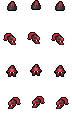
7.5
Better than your goggles. Beautiful shadings and drawing.
5.5
Would be nice, but the back view is REALLY wrong. Try it with the body to see. This kind of errors makes me think to a rip, anyhow it's a heavy error.
11 Drhaut2

6.25 7
Great use of gradients, but I didn’t remember hats had one. The gradient effect gives it a sort of metal feeling.
6.5
Very nice but simple (anyhow test it with the dress!)
6
Maybe too big. Nice shadings.
5.5
Heavy error: the background isn't white!!! Impossible to use without changing it.
11 Rosebud_akc

6.25 6
Too bad it was saved as BMP. It is a good resource. It really looks like Yuna’s… well, almost.
6
Wrong position in various point, may it be a rip?
8
Very beautiful, especially in shadings.
5
BMP and no white background... is his made by you? The hair itself are cool, these kind of errors are really strange...
12 Carmen

6.13 5
Isn’t it just a recolor of another resource? It seems not. But still, I have high doubts about this one after comparing this and another…
6
Not bad but i think it's a rip. Moreover it's a 24bit image.
7
Walking animation could be done better.
6.5
Simple but nice. Anyhow, testing it with the body shows an error on the first left frame, and this make me think to a rip...
13 Runeblade

6 6.5
Well, it would have been better with some shading. It looks a bit too plain.
6
Less is impossible, eh? Anyhow it's exact. XD
5
No shadings, try again next time.
6.5
Position is ok, maybe too poor in details.
13 Drhaut2

6 5
This one is a recolor of the other resource.
7
Nice. Your 3 resources together may be rated 8!
6.5
As the other one, it lacks in shadings.
5.5
Heavy error: the background isn't white!!! Impossible to use without changing it.
14 The_RPG_DEITY

5.63 6
First of all, this appears to be just a BMP file renamed to JPG. Second, JPG files can leave artefacts behind. The resource itself looks good, but the colouring isn’t that great.
4
I don't really like this.
7.5
Beautiful, with more shadings could be perfect.
5
It is a BMP renamed in JPG. No PNG everywhere...
14 X_Destroyer

5.63 5
The green background lowers your score. The background should be white.
6
Excluding the green background it's banal, exact but nothing more.
6.5
Lacks of some shadings.
5
Good position but... Heavy error: the background isn't white!!! Impossible to use without changing it.
15 DraculaX

5.13 6
Well, this one is too small to even be noticed. It isn’t too much work to make it either.
5
It's well positioned, but i really don't like it.
4
Too simple.
5.5
Very simple, but IMHO the point is that you've not drawn the right frames. There is the "Item on top or back (by row)" function for this.

  FINAL WORDS FROM THE JUDGES
facegen resources - charas resources - final words from the judges

JUDGE FINAL WORDS
Alex The quality was really high, this time!
I think everyone did his best, some resources are really awesome (Adjuma expecially did the incredible, in my opinion).
My judgement was more technical, i've been really severe sometimes for background or white errors.
But i have to say that the level was impressive, really hope my comments may help you all in doing every day better!!!
SMB First of all i have to notice that quality of contest's resources is really improved from the first contest, alomst every work is rated sufficient, so i've been a bit more severe in judgement punishing things as bad "almost white" usage, non-reduction of colors and misplaced formats.
Personally, over The Brave which makes me thrill (evenif with some error on "almost white" in the helm), the cape alone whouls be enough to make all other resources disappear, and without talking about the armor! I am very stricken by Adjuma's resources, really nice and very original! Also, i like very much Drhaut2's suit and Onichi's resources are very beautiful.
Gary Well, as usual, you will hear me bihatching again. I want to comment the lack of applying the rules at some points. Especially the PNG only rule. Next I would comment the way the resources are posted. Please, tell us for WHICH GODFRICKIN' CATEGORY IT IS. Personally I think TheBrave again proved to be a good contestant, but for me Adjuma was slightly better. But it could also be because I like girls, especially girl dresses. Sexy dresses that is, hehehe...