First thing as usual: many thanks to all the partecipants and to the judges, great jobs from both!
As for our tradition, every resource have comments from every judge.
I really think this can help anyone in understanding, learning, taking example.
Comments will help you to understand eventual mistakes, just to become better every day.
Having more judges cause also different ratings: there is a good balance between "look" and "tercnique".
So don't be angry if someone rate you 8 and someone else 5: it is simply from different points of view.
And, i have to say, this is nice: a Charas resource need both "good looking" and "good realization".
This is why i am so happy about this cross-judging.
Many thanks also to Setzer and J@C, from VGMaker Italia, our affiliate and a great italian community.
If you want to comment the results, please do it here.
A last note about the proposed "connection prize":
As you can see in final words below, we appreciated much Apex's and Moiledzep's works (same subject for all of the generators).
Techically Moiledzep's works are superior, but Apex's idea rocks!
So i will not "assign" this prize: I can quitely claim they won it together!
At the end... greetings to both of you!!!!
Well, time for words is over: here you have the results!
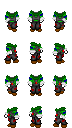
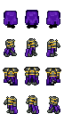
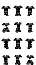
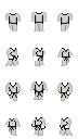
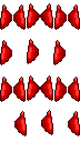
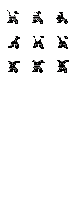
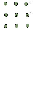
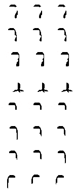
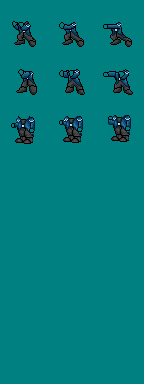
6 Too cunfused, not so special and it seems the front neckband lacks some pixel moreover 24bit
9 very good!I like it...
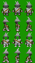
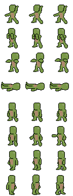
9 Oh yeah,this is one of the better resources I ever seen!The shading was made well,and also the drawing and the animation!With the right chipset you would make a great graphic!
8.5 Maybe a bit too complex, but correct and very well realized! If not 24 bit it would have been rated more!
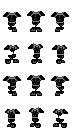
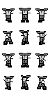
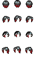
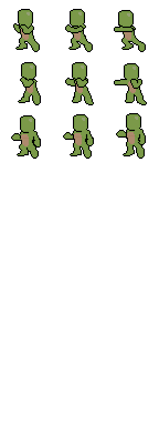
8.5 Good shading and drawing.It's not animated,but t's a great resource!
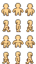
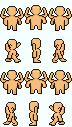
6 I'm embarassed... it's a great resource, but medium chara was not allowed for this contest. As a resource it deserve 8 without problems for me, but i have to give 6 to respect the rules.
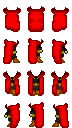
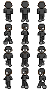
6 Neither the colors and the shading are excellent,it's a very simply resource.It's also not very very useful,i need more to be impressed.Anyway it's pretty,it fix and moves well.
6.5 I like it very much, but the front view position is too low, to be corrected!
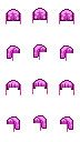
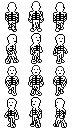
5 Not very good...
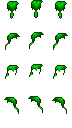
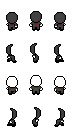
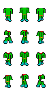
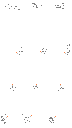
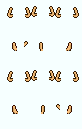
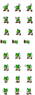
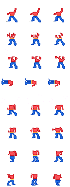
5.5 So,this resource could be an original or useful idea,but i found it is not good looking if you use mani items o suits: when the hero is walking down it doesn't seem to be a cigarette and when the hero isn't moving the smoke stops,too.Anyway,a quite good resource!
6 I will credit the idea, but mid section was not allowed... Anyhow, 24bit and there's a wrong frame (a smoke pixel out of grid)
5 I tried this a couple of times,but i think it has some strange things in fixing.By the way,a better shading would make the difference...also the drawing is quite simple.
6 A bit too simple, and some pixel errors visible in animation
Higher quality every time!
As an admin, i'm fully satisfied, everyone did his best.
I saw very good ideas, without the worryness of being or not able to do something.
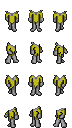
Apex and Moiledzep are great on this side: maybe the cigarets are not well realized, but the idea was amazing!!!
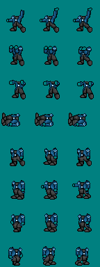
Also SaiKar REALLY impressed me: his bchar resource is something incredible!
My ratings are sort of "averages": i rated mainly technical realization and first impression looking.
As usual, i hope my comments may help you in growing every day more!
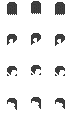
SMB
This time i had to be more severe, first of all because the level is really high,
and because after all this time it's not acceptable the ignorance about "almost white" which in Charas
is fundamental, or to be wrong in placing for some pixels (evenif few), or to present 24bit resources!
So many works received lower ratings for these reasons when maybe without these errors they would have been rated more!
Moreover, while judging, i tried also to rate the real usefulness that some resources have for Charas.
Gary's idea unfortunatly was not listened by many, but in some cases it produced really interesting things,
so i leave to Alex the option to manage an extra rate to be given to GoldDean and Moiledzep works. They deserve it,
for their shown engagement.
I also propose an higher rate to Apex's works for his idea which i really loved, evenif not optimally realized.
The best resources at all in my opinion are Saikar's "Awal Armor", Sharu's "Narimi Hair" and Pedro Lion's "Black Armor".
Also good is the GoldDean's "Gothic".
J@C
This is the first time I judge for contest,so I was not sure of the resource's comments.
I think I did my best,I gave 9 when it was a very good resource,I gave 5 when there were imperfections.
I have not a lot to say,these comments simply are related to my experience, if you aren't shure of your resource's judgement,ask and i will reply ^_^.