Logo by GaryCXJk
Tilbage
| Place | Resource | Author | SMB comments | Alex comments | Average rating |
|---|---|---|---|---|---|
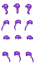
| 1 | 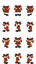 |
TheBrave | 7 Beautiful, evenif too complex. |
7.5 A bit complex, but very well drawn and shaded. Beautiful in motion too. |
7.25 |
| 2 | 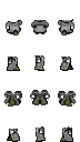 |
Cosmo | 7 It would need some finetunings, but in general it's beautiful. |
7 Beautiful till the neck, but the higher part sometimes has unusual movements. It would have been rated 8. |
7 |
| 3 |  |
Nukes | 7 Beautiful, well done and well placed |
7 Beautiful, but non-usage of the "front/back" utility is a shame (for using it with other bodies too). |
7 |
| 4 4th place for this resource just because you the winner. You cannot win EVERYTHING! ;) |
 |
TheBrave | 7 Very beautiful, 8 if with moving topknot! |
7 Really well done, expecially in shadings. Maybe better with a more sweet movement in laterl views. |
7 |
| 5 | 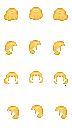 |
Alea | 6.5 Not bad, in motion one ear is out. Maybe it's wanted? |
7 Beautiful the movement and the shadings, i think the ear is wanted |
6.75 |
| 5 | 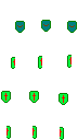 |
FF2and3rocks | 6.5 Nothing superb but good. |
7 Simple but good effect. Pretty in motion, evenif the back view follows too much the body. |
6.75 |
| 5 | 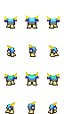 |
Gary Kertopermono | 6.5 Pretty, but nothing more. |
7 Pretty, in motion too. Maybe a bit too much "pastel colored". |
6.75 |
| 5 | 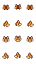 |
Iron | 7 Pretty, but i think i've already seen it. |
6.5 Pretty, but white error on the neck in the front view. |
6.75 |
| 5 | 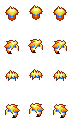 |
Iron | 7 Pretty, but i think i've already seen it. |
6.5 Beautiful, but wrong white pixels in the left and right views (same error in all the 6 frames) |
6.75 |
| 5 | 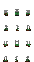 |
JP | 6.5 Neckband too high in the lateral view, anyhow not bad. |
7 Pretty in motion, i like the high neckband too. |
6.75 |
| 5 | 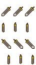 |
Runeblade | 7 Pretty, maybe already seen? |
6.5 Pretty, but 24 bit made. Wrong position in the seventh frame (out of grid) and wrong movement in lateral views (fix instead of in motion). |
6.75 |
| 6 | 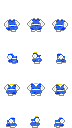 |
Alea | 7 Really not bad. |
6 Simple and pretty, but the front view in motion has something strange. Moreover, applied on the body base it has an error in the second frame (in that position there is the black line of the body, not it's color). |
6.5 |
| 6 | 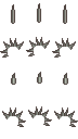 |
Charao | 6.5 Not perfect but original idea, there are some imperfecions but globally good. |
6.5 Agree with SMB. |
6.5 |
| 6 | 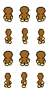 |
Gary Kertopermono | 6.5 Very original but too limited using it with faces and dresses. |
6.5 Pretty also in lateral shadings, but not overlappable the the base body. |
6.5 |
| 6 | 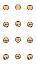 |
Runeblade | 6.5 Good idea but not well realized, it would deserve more with moving eyes. |
6.5 I agree, also i feel the lack of some mouth in central frames. |
6.5 |
| 7 | 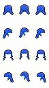 |
Sharu | 6.5 Pretty but badly cleared, i feel some pixels have to be removed. |
6 Some motion would had been nice, in the back view it makes the neck too visible and regular. |
6.25 |
| 7 | 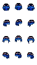 |
Uberbilly | 6 It was in BMP and lateral views seems incoherent with the front one. |
6.5 I like it very much, in motion it has e really good effect. Also well drawn. But why in BMP... |
6.25 |
| 8 | 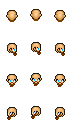 |
Alea | 6 Limited in use because the beard become covered by many dresses. |
6 Good eyes, but the beard had to be an item. |
6 |
| 8 | 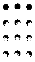 |
Gary Kertopermono | 6 Good design, it would have been better with some more shading. |
6 I Agree. Anyhow, also without shadings, forelock movements would have improved the effect a lot. |
6 |
| 8 | 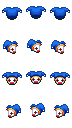 |
Iron | 6.5 Pretty, maybe i've already seen that? |
5.5 Wrong usage of the "cover white" (255,255,254) in the back view, and pure white in the last two frames (it's transparent, and makes the body visible). |
6 |
| 8 | 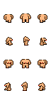 |
Marknitro | 6 Without the head it gives problems of losses pixels, debatable animation. For Hentai games it could be interesting. |
6 Bad movement of "tits". Moreover, being a body, it should have had also the head, to avoid inconsistency over the neck. |
6 |
| 8 | 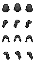 |
TheBrave | 6 Not really interesting and i feel already seen. |
6 Pretty but too static. Some motion would had been nice. |
6 |
| 9 | 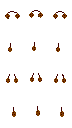 |
FF2and3rocks | 6 The fron view is wrong, it covers the eyes. |
5.5 Not only the front view, also the back view has a too much low junction. Moreover, the right muff of the first frame is wrong |
5.75 |
| 9 | 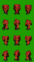 |
Trunks212 | 5 It's a shame! Green background and misplaced. Without these errors it would have been rated 8! Very beautiful, but we've to rate all the faces of these works. |
6.5 True, heavy errors in color and positioning, but very well drawn, also the shadings. Greetings Anyhow! |
5.75 |
| 9 | 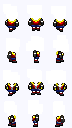 |
Uberbilly | 6 I'm not really convinced... |
5.5 Heavy error in feet position. The fron and back views have the same left/richt feet position! |
5.75 |
| 10 | 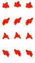 |
FF2and3rocks | 5 A bit too strange, both in design and colors. |
6 It's too static, also bad placed in the second frame (and it's too clear in motion). |
5.5 |
| 10 | 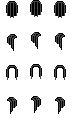 |
Mahars | 5 Certainly it can be done better. |
6 Not good looking, but it works. Anyhow, there is an error in the fourth frame (when in motion, it creates a jump effect to all the neck). |
5.5 |
| 10 |  |
Mahars | 6 Few detailed, this too can be done better |
5 Too simple, and cutted around the body instead of using the "front/back" item's utility. Moreover, it is misplaced (frames out of grid). |
5.5 |
| 11 |  |
Mahars | 5 Is this useful, already having elf faces? |
5.5 It's just the base face with two straight bars as ears. |
5.25 |